


Scott Nash
PROFILE-August 2010
By Chelsea Holden Baker
Photographs by Jarrod McCabe
Illustrator-writ-large, bird lover, candy man
If he worked at Disney, he’d be called an Imagineer. The illustrator, author, designer, and media mind Scott Nash has done independent work for Disney and seemingly every other major player in the kid’s media market over the past 25 years.
Scott Nash loves mash-ups. In fact, he’s something of a mash-up himself. An author and illustrator, consultant and content producer, professor and student, he has made a career out of listening to kids and delighting adults. His graphic work in the early days of MTV led to the development of Nickelodeon’s brand identity, which led to logos for Comedy Central, Nick at Nite, the Cartoon Network, and TV Land. He has concepted kids’ cereals, toys, and stores. He has reimagined characters like Jeff Brown’s Flat Stanley and Dr. Seuss’s Hooper Humperdink, while illustrating more than fifty other children’s books along the way. He has a 250-page illustrated novel in the works. He’s both prodigious and playful, an islander and a city guy.
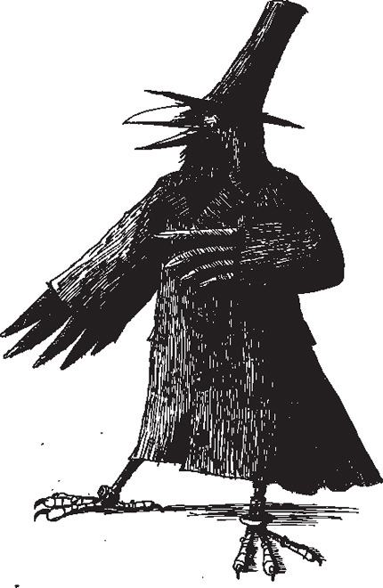
On paper, Nash appears diminutive. In his signature pen-and-ink self-portrait he looks wary, drawing in a chair with one eye squinting, his general mien crumpled and inward. But off the page, curiosity turns him inside out. As he unfolds his 6’5” frame with a ready smile and kind eyes, he says of his mash-up approach, which he calls “the Reese’s Peanut Butter Cup philosophy,”—”Why not take two things that taste great together and merge them!” His current fixation is rendering birds as pirates (the subject of his 250-page novel). If you look at Nash’s Blue Jay the Pirate once, it might make you laugh, but the next time you see a bright-blue bird swooping toward a feeder, it will look like a swashbuckler swinging through the topsails.
And that’s where the fun comes in. Nash never seems to see just what’s before him—he’s either thinking about it critically or imagining something more. He likes to experiment and he likes narratives, which is part of what makes him and his artist wife, Nancy, such legendary Halloween hosts at their home on Peaks Island. They themed their shindig event “Holy Molar” this past October, and created a house of rotten-tooth horror courtesy of the dark-robed Cult of Sugar, which required trick-or-treaters to exit the party through a black-lit dentist’s office that featured beastly blown-up images of oral disasters situated around a vintage dentist’s torture chair.
Nancy and Scott met in high school on Cape Cod, the same area that attracted Edward Gorey, another famous, but older, illustrator. “He was a regular character in town,” says Nash. “We’d see him at diners and such and he’d do theatrical performances.” Nancy’s brother is now a curator at the Edward Gorey House, a museum of the artist’s life and work that is housed in his former home. But in his teenage years, perhaps as a reaction to the peninsula’s association with Gorey, Nash stayed away from the somewhat archaic pen-and-ink that attracts him now. He started out on the other end of the spectrum: designing T-shirts for a company called Cotton Pickin’ Tees. “We got to test out a lot of designs and make a lot of mistakes. What was interesting was that we’d put the designs out there and get quantitative results.” The hottest selling T-shirt at the time was a drunken quahog. Its designer, John Sullivan, noticed one of Nash’s designs—“a sort of R. Crumb looking turtle holding a daisy in his hands that I drew for Nancy,” says Nash. The humble turtle went on to usurp the clam as sales king, giving Nash his first taste of success.
Nash worked, really worked, through college. He did production for Cape Cod Life magazine, and when his fellow students at the Swain School of Design (now a part of the University of Massachusetts at Dartmouth) fought the board in an attempt to receive accreditation, Nash staged a “work-in,” which got their group written up in newspapers and publications across the country, including The Chronicle of Higher Education. Nash went on to the prestigious Cranbrook Academy of Art for graduate school, and on the day he graduated in 1984 he joined one of his professors, Tom Corey, in a new design venture—Corey McPherson Nash.

It wasn’t long before Nash began urging his partners to break out of “the work that every respectable design firm in Boston does—Harvard and hospitals,” he says today. They set their sights on New York, “and we—almost literally—knocked on doors,” Nash recalls. “The door that opened was MTV. The whole cable world was sort of the ghetto of entertainment. No one was taking it seriously, and I think that’s why we got in.” The team was hired to change the young network’s typography, but proposed they continue to alter it each month. MTV loved it. They asked the firm to take on their children’s network, Nickelodeon, whose logo at the time was a bouncing silver pinball. “It’s something that I point to as the antithesis of the way we approach kid design,” says Nash. “It’s based on somebody else’s impression of what childhood is like. It’s largely nostalgic and at that point pinball wasn’t very relevant.” Instead they came up with the dynamic logo that’s still in use today.
“After Nickelodeon, I was smitten with kid’s media,” says Nash. He created Big Blue Dot, a spinoff of Corey McPherson Nash, to focus on all things kids, including investing in research that fine-tuned his ear to hear what kids really think and feel.
“You have to listen beyond the surface sometimes,” Nash says. “In focus-group testing, if kids say something is ‘good,’ it’s not necessarily good. Good is about the most noncommittal thing—it’s almost condemning. But ‘funny,’ ‘cute,’ or ‘weird’ could work.”
Nash was inspired to package these kinds of insights into a quarterly subscriber-based publication called The Big Blue Box—a cubic-foot box containing a binder of kid’s trends and sociological issues, along with relevant artifacts. The box could contain everything from super sour Warheads candy to reports on violent video games.
“We weren’t judgmental about whether something was good or bad,” says Nash. “One of my favorite issues was video games. We’d report on what happened in the games and then allow people to draw their own conclusions.” Of course, they often needed to enlist the help of kids on their projects. “This was when Mortal Kombat had just come out, but we couldn’t get to any of the ultra-violent levels,” recalls Nash. “So we had to hire college kids to come in and play the games. I’d be in a meeting and the kids would come in and say, ‘Mr. Nash? We got to the part where the guy rips his victim’s heart out with his skull and his spinal cord—do you want to see?’ and I’d say, ‘Yes! I’ll be right back!’”
But managing the day-to-day operations of a successful business took its toll. By 1998, Big Blue Dot had swelled to 30 people. Nash’s “little spin-off” was now a significant player in the industry, and they were taking on work from Asia to England. Coupled with Corey McPherson Nash, the total employee headcount was about 75 people. “In kid’s media, I became the bourbon guy,” says Nash. “It was a lot of deal meetings, when what I really love to do is make things.”
So although Nash had never considered himself an illustrator—he had studied graphic design and painting in school—he made a picture book with Tom Corey and they sent it out. The story of Sparky and Arfman didn’t stick with Candlewick Press, but the British publisher loved Nash’s style. They asked if he would like to illustrate a new book, Saturday Night at the Dinosaur Stomp, ushering in the next phase of Nash’s career.
While writing and illustrating could be a lonely pursuit, Nash’s love of collaboration keeps him in constant conversation—conversations that have ripple effects. In talking about the legacy of Leonard Bernstein, Nash helped to inspire the creation of From the Top, National Public Radio’s classical-music program that features child and adolescent performers, and he has been a consultant to the radio show for the past decade since it began. While talking with Maine’s first lady, Karen Baldacci, at a literacy event, the two came up with a cultural-exchange and collaborative children’s book with Toshiki Sawada, an illustrator from Maine’s sister state of Aomori, Japan. When the Maine College of Art asked Nash to teach a course, he chided two deans for not having an illustration major, then became instrumental in making it happen by pulling in other nationally renowned Maine illustrators—such as Allen McGee, Bruce Hutchinson, Jamie Hogan, Mike Gorman, and Mary Anne Lloyd—to create a curriculum for the major, which is now one of the school’s most popular.

Nash also started teaching. “In kid’s media, both here and when we established Big Blue Dot in Boston, I always felt uncomfortable with idea that we were experts,” he says. “What I preferred to say was that we were committed students.” Teaching has made him a better student, and like his late professor Tom Corey did for him, he has pulled up talented students along the way.
This past year he formed NASHBOX, a design firm for kid’s media in Portland, with his wife Nancy and Scott Whitehouse, one of his former MECA students. “I’m convinced that eventually Portland can become a real center for kid’s media. I know that we have the collaborators here to do full-blown production, and I’m hoping to develop some shows and technologies geared toward kids.” The iPad has also gotten him thinking. “Much in the way, years ago, we started knocking on the doors of cable networks, I start looking at the technology to see what we can do with it—how it informs a narrative,” he says. “I can’t help it, I get ridiculously excited about this stuff.”
scottnash.com | nashbox.com | CoreyMcPhersonNash.com