Making a Landmark
A colorful new mural in the heart of Portland honors the burgeoning city's progress

The chosen mural colors were studied by Sears and juxtaposed in a way that is meant to “activate the viewer’s
eye,” he says.
South Portland artist Will Sears was unanimously selected by a committee to paint the mural at 80 Exchange Street in Portland.
Two years ago, I was standing on Exchange Street in Portland, looking up. Some friends and I had decided to stop at Tommy’s Park for a break in the shade while we waited out the crowds of the Old Port Fest. While my friends were resting, I made my way to the base of 80 Exchange Street to get a closer look at a piece of art that, to me, had always existed. The landmark trompe l’oeil mural had covered the building’s facade for the past 30 years, but it was the first time I had really taken a moment to admire it. The artwork loosely portrayed a U.S. postal building that once sat across the street but was demolished in 1965. From far away, an edifice with four towering white columns both welcomed and tricked Old Port travelers. Up close, the mural was beautiful from every angle, but its shadowed grays and peachy oranges were flecked and starting to show signs of age.
Painted in 1986 by local artist Chris Denison, the optical illusion branded the street for decades, but in the spring of 2018, a historic change took place. Fathom Companies, which owns and operates the Press Hotel along with a real estate development branch that largely focuses on the revitalization of historic buildings, had acquired controlling interest of the building, which houses the Grill Room and a few offices, including Maine magazine, and it began a major historic renovation. “The masonry behind the mural was deteriorating to a point where we would’ve had to dig into the grout and ruin the painting that was there,” says president Jim Brady. An expert mason was brought in to help with the restoration of the wall, but the trompe l’oeil was lost.
Brady and his team felt that it was important to replace the mural rather than leave the wall blank. They wanted something new that would reflect Portland and its changing energy. The city has progressed a lot since 1986; it’s become younger and more diverse, and over the past several years Portland’s food and beer scene has garnered a significant amount of national attention. Brady and his team wanted to integrate a piece of community artwork that could speak to this growth. With the help of independent art consultant Erin Hutton, a committee of eight local businesspeople and art professionals, including Brady and Chris Denison, issued a call for submissions. The submission criteria didn’t require that the selected artist be from Maine, but it was important that they should feel a deep connection to the state. “It wasn’t just about what is best for the building—what is best for the city?” says Hutton. In total, 47 artists submitted for a chance to paint the four-story canvas.

A seven-person crew completed the mural in a month: here, Jesse Littlefield, Ryan Adams, and Tessa G. O’Brien work on a scissor lift to paint a section of the wall; other contributing artists were Jenna Pirello, Bee Daniel, and Spensor MacLeod. 
Sears adds the finishing touches
to a section of the mural.
To narrow the selection, the committee went through a series of reviews. Three finalists were chosen, and each was given a $500 stipend to refine their proposal. The selected finalists were Michael Droge, who proposed an abstract depiction of nautical maps and figures; C.M. Lewis, who pitched another trompe l’oeil design; and Will Sears, who presented an abstract design with bright colors and geometric shapes. Each artist returned to the committee to present their design for a second time, but with detailed models, drawings, renderings, and samples of previous work. At the end of the process, the committee unanimously selected South Portland artist Will Sears. “His work was vibrant, it was bold, it was really thoughtful; his theme of understanding the light of the city was really special, and it resonated with the committee,” says Hutton.
Painting a mural requires special insurance and equipment, as well as a knowledge of how to execute a project of such a large scale. Sears, who cofounded Better Letter Hand Painted Signs, a signage and mural company based in South Portland, had no problem meeting the necessary requirements. Sears is well-versed in large-scale works and is responsible for a handful of other murals throughout the state, including a mural along Portland’s Back Cove Trail and one on Water Street in Augusta. In addition, Sears and his partner, Tessa G. O’Brien, started the nonprofit Portland Mural Initiative in 2015. For three years, the project sought to bring contemporary art into public spaces and to promote a dialogue between the mural artists and the communities in which the murals are located. In total, seven murals were completed by seven artists under the initiative.

Before painting began, the mural was broken into to a twelve-by-twelve grid that mimicked the building’s natural stucco grid. 
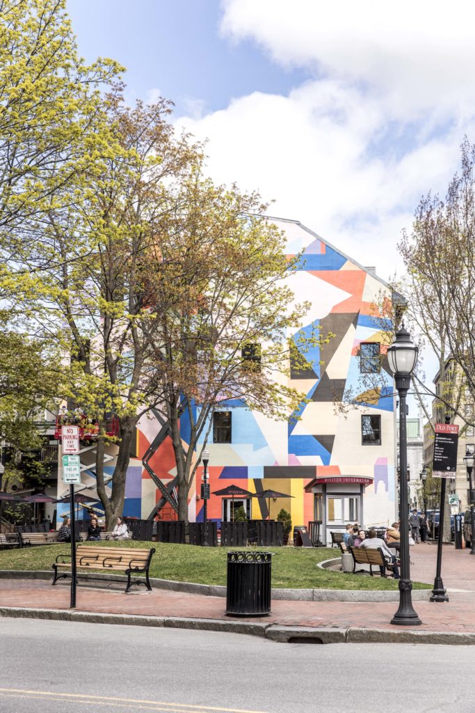
From the base of the 80 Exchange Street building, the bold colors reflect the vibrancy of the Old Port.
The mural at 80 Exchange Street took a month for a seven-person crew to complete. To translate the design from paper to painting, Sears broke the mural into a twelve-by-twelve grid that mimicked the building’s twelve-by-twelve stucco grid. “Most of it is just thinking about how shapes will function compared to human scale and compared to building scale and any surrounding things,” says Sears. For example, there could be trees that alter the view, windows, or surrounding colors that can’t be avoided. “There is a lot to consider,” he says.
“Because it’s not representational, there is no forced dialogue. It’s kind of up to the viewer to extract whatever they want from it based on where their mind is at on that particular day.”
Originally from Pennsylvania, Sears has spent the past ten years living and working in the Portland area. In much of that time, he’s been studying his surroundings. “All of my work is informed from observation,” he says. Sears immerses himself in his environment and analyzes the th18ings that catch his eye; whether it’s architecture, certain relationships with color, or natural or man-made shapes, he seeks to see something familiar in a new light. He then records his observations and distills them into imagery for his work. “It’s basically a meditation on or regurgitation of observation,” he says. In order to create the concept behind the winning proposal, Sears conducted a series of color studies on paper, experimenting with how colors juxtapose with one another and affect the colors next to them. He then cut the paper into various shapes and rearranged them into a collage-style format, playing with the shapes until he reached a composition that would activate the viewer’s eye. “It’s an abstract interpretation of Portland’s colors and shapes,” he says. “Because it’s not representational, there is no forced dialogue. It’s kind of up to the viewer to extract whatever they want from it based on where their mind is at on that particular day.”
Share The Inspiration
