


L.L.Bean Behind the Scenes
FEATURE-January + February 2012
Photographs by Jonathan Laurence
Maine magazine talks with L.L.Bean creative directors Marcia Minter and Jenna Klein Jonsson about their latest project: a contemporary reinterpretation of two classic bean covers
What was the original inspiration for going back to vintage covers as a direction for the shoot?
Reinterpreting vintage catalog covers for L.L.Bean’s 100th anniversary is a way to celebrate the timelessness of L.L.Bean. So much about these old covers is still relevant—the activities, the sense of humor illustrated in these images—and we really wanted to celebrate that spirit.
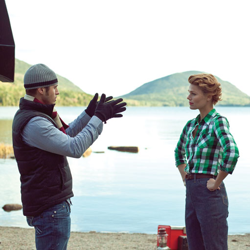
How did you come to photographer Randal Ford? Tell us a bit about his unique style
We’ve been admiring Randal’s work for many years, and we’ve been waiting for the right opportunity to work with him. Randal is a commercial photographer with a very unique style. He pays incredible attention to detail, which is evident when you look at the vintage covers and their reinterpretations side by side. Randal’s photographs are very much like paintings, so this project provided an opportunity for us to continue the L.L.Bean tradition of catalog artwork in a more modern and outside-of-the-box manner.
How about model selection?
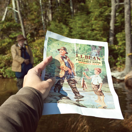
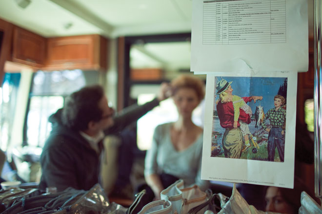
For the shoot based on the 1933 catalog cover picturing an old man and a boy fishing, we approached a local theater company out of Portland and also put out a casting call to our employees. It was important to cast characters who could “play the part.” Their age, body type, facial expressions, and other physical characteristics needed to be spot on. For the reinterpretation of the 1956 cover picturing a man, woman, and sleeping child, we were a bit more conventional: the man and woman who were casted have modeled for L.L.Bean for quite some time. If you look closely you’ll notice that they are actually featured within the pages of the catalogs as well as on the covers.
Where did the clothing and props come from?
The apparel is a mix of old and new. For example, the older man is wearing vintage L.L.Bean waders we found on Ebay, while his fly rod and coat are from L.L.Bean’s archives in Freeport. The young boy in the same cover is wearing an outfit borrowed from the Metropolitan Opera. The woman is wearing a shirt from L.L.Bean Signature, but it is remarkably similar to the shirt in the original painting. The man is wearing a chamois shirt, pants, and belt from L.L.Bean’s current menswear line.
Tell us about the location of the shoot. Is it the same place depicted in the originals?
When we first started working on this project, we asked our corporate archivist if there was any documentation of whether the paintings actually had a real backdrop location. Unfortunately, this was something that hadn’t been documented. Both covers ended up being shot at Acadia National Park, which is where many of L.L.Bean’s catalog shoots take place. To us, the park is “iconic Maine”: an amazing outdoor backdrop with beautiful lakes and foliage.
How were the two scenarios selected? And from how many other options?
This was a really fun part of this project! With 100 years of catalog covers to choose from, we certainly didn’t have a lack of options. We knew right off the bat that we wanted to use older images. We wanted covers that offered a sense of story and a sense of humor. Both of these images really deliver on that.
When will readers see these catalogs?
The reinterpretations of the 1933 and 1956 covers will appear on catalogs coming out in late January and late March 2012, respectively. We know people may be intrigued by the art, so we are making the images available for purchase as canvas reprints. The images will also appear online and on our Facebook page. We’re working on a video of behind-the-scenes footage as well.